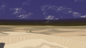
HIGHLIGHTS:
- TACTIC S-Types, schema, & workflow development
- New color-check monitor installed & calibrated
- Adapted worklog recording to dual-monitor setup
- Worked on sunrise and day lighting in Lunatics S1E01-SR-2
Lunatics is still in the doldrums, with me stuck on the lighting for the “timelapse” shots in the “Soyuz Rollout” sequence (S1E01-SR-2).
Despite putting a lot of effort into it, the TACTIC project hasn’t gotten very far. Konstantin did suggest an alternative platform (Prism), and I’m not sure how I feel about that — it’d be starting all over again. I don’t think my problems with TACTIC are a fault of the software, but just that I have a lot of learning curve to get past.
I’ve made no real progress this month on software development.
The Pandemic is starting to really wear on me, and my mood was pretty poor this month.
Jun 8, 2020 at 4:01 PM
Color-Check Monitor
Earlier this year, I realized that I was not seeing correct color while editing “Lunatics!” and this resulted in some colors not appearing correct when viewed on other monitors, and so I attempted to color-calibrate my large workstation monitor (which, for cost reasons, is actually an HD TV).
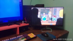
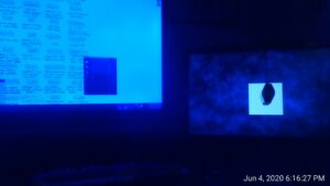
While it is not so obvious to the human eye, you can see how very blue this monitor is in the photo above (you can see the corner of the workstation monitor on the left in the lead picture).
I’ve already done as much as I can to adjust the color on that monitor — it’s simply not possible to adjust it further.
And so my color-calibration attempt was a failure. For a long time, I wasn’t sure what to do about this situation.
I had never really taken color-calibration seriously before, so I had a lot to learn. For video work, what I really need is a monitor that can represent the full NTSC color gamut (also know as SMPTE), which is quite a bit larger than the sRGB color gamut used for most desktop publishing work (essentially, the NTSC color space includes brighter greens).
I found that it was possible to acquire “high gamut” monitors, and indeed ones that could correctly represent the NTSC gamut, but to acquire a direct replacement for my 43″ UHD monitor would have been about $600 (quite a bit more than I had paid for the current HDTV, and certainly more than I could afford to spend). I finally settled on a compromise solution of getting a smaller high-gamut monitor for previews and color-sensitive work, and combining it with the old monitor (as bad as it looks in the picture above, it’s actually quite usable for ordinary computer work where color accuracy is not so critical, and the extra pixel space means I can put a lot of reference material on screen together at one time — it’s a lot more efficient than trying to work on a standard size monitor.
The new monitor is a 24″ Philips 246E — a fairly pricey monitor for its size, with color accuracy being a primary selling point. The monitor exceeds the NTSC gamut (about 108%) and the sRGB gamut (about 130%), which means it can pretty much give an accurate display of whatever I throw at it. This monitor would have been about $300 new, but I was able to find a “recertified” one for $150 from Newegg — which is not bad at all. For comparison, the cheap 24″ budget monitors I’ve bought from Walmart for other desktop computers were about $90-$110. Considering the leap in quality, it was certainly a bargain.
Honestly, I expected this to be a subtle improvement that I wouldn’t really appreciate, but in fact, this monitor is pretty impressive in person. I was really surprised at how much better and brighter it is. And, of course, you can see that it looks much better in the picture above — photos of monitors are not very forgiving, but this one shows up pretty well.
The uncalibrated monitor already looked much better, but of course, I had already bought the X-Rite Colormunki colorimeter to calibrate it with, and I immediately used DisplayCAL on it. This time, of course, it worked!
After calibration, the monitor display is slightly less garish and has very accurate color display.
For simple playback, this issue doesn’t really matter that much — “Lunatics!” still looks pretty good on my main monitor, and it looks fine on my TV in the house. But color-checking it on a fully-calibrated monitor means that the color will be standard and predictable, so that it should look good on your monitor, too (and if it doesn’t, it’s at least going to be your monitor’s problem, and not the video itself).
What this does, of course, is to create an ICC color profile for the monitor, which is then installed into the color management configurations on my workstation. This gets pretty deep in the operating system, and I don’t fully understand everything it effects, but for the most part, in Ubuntu Studio, it “just works”, so I don’t have to (removing it if it turns out to be a disaster, as it was on my old monitor is much harder!).
I immediately reviewed all the animated footage rendered so far, but I actually don’t think it will need to be color-corrected. The color errors I noticed are pretty minimal, and will probably only be noticeable to me.
So, at least for now, I’m just going to focus on getting correct renders from the rest of the episode.
Jun 10, 2020 at 4:01 PM
TACTIC Relational Schema Design
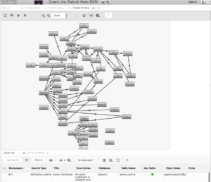
I’ve moved on from defining “S-Types” in TACTIC, and now I’m learning how to design a “Schema” that connects them together conceptually. I’m only just learning how to use this effectively.
As you can see, it currently looks like a huge rat’s nest. I’m not really sure if I’m doing a good job at laying out the relations. The links are really just key-fields connecting each object to a “parent” object. This makes it possible to have multiple “shots” identifying the same “shot block” as their parent, or multiple “shot blocks” identifying the same “sequence”.
It’s also possible to connect recorded voice lines with the actor who performs them and the character they represent, as well as the audio mix which includes them.
This visual design of the relationships between assets is definitely an improved functionality relative to Resource Space, which doesn’t really have the same concept (although you can define custom fields to identify connected assets).
I do have one complaint: When I establish a new relationship between types and click “Ok” to save it, it apparently doesn’t always do so. I get errors when I try to save the whole map, and then I have go back, open each connection, and then re-save it. So far, that has always fixed it, but I don’t know why it didn’t take the first time. The display also doesn’t show any clue that this problem exists — I just get error messages telling me which one isn’t defined. So that can make saving a slow process of iterations.
But this should be an infrequent operation. Once I’ve defined the schema, I should be able to save it as a template, and use it ready-made for other projects.
Jun 21, 2020 at 4:01 PM
Better Horizon
I’ve been working on the lighting rig for the two “timelapse” shots in the “Soyuz Rollout” sequence. One of the main effects is the sunlight changing from “dawn” to “sunrise” to “morning” and then “afternoon”.
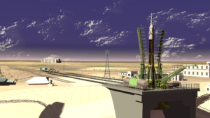
This immediately created a problem, because the edge of the shot is a cylindrical backdrop. Originally, I just set it up to be “shadeless”, which worked fine for full daylight, but looks totally wrong when it’s still fairly dark.
My first try was to simply changing the shader settings so it would pick up the scene lighting, but this didn’t work at all like I had hope it would:
I never could get that to work.
Finally, I created a double backdrop with separate coloring for the “distant mountains” and the “dust haze” effects.
I believe I can animate the colors on these to create the desired effect as the light changes. It already looks quite a bit better, as you can see in the lead image.

