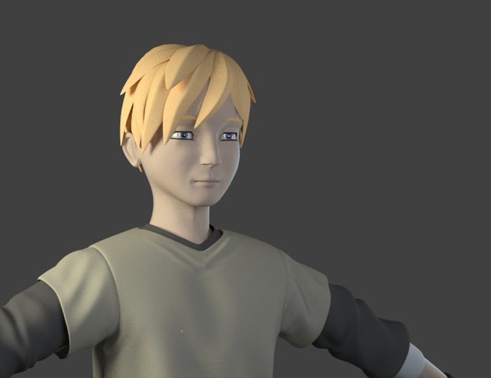
There are several factors we have to balance in coming up with a style of animation and rendering for “Lunatics!”
You might think that 3D animators should always try for maximum realism (“photorealism”) when making animation, but this is not necessarily a good idea. First of all, the human eye is extremely good at spotting errors in photorealistic renderings and especially in animation.
This is the basis of the problem known as the “uncanny valley effect”: if you have extremely photo-accurate models and renderings of characters, then even the slightest error in movement creates a disturbing “creepy” effect. Such animations are often described as “zombie-like” or “doll-like”. This is because we are very sensitive to tiny differences in the way real people move.

Cartoons get around this problem by having characters which are highly stylized. Your brain fills in the gap between what you see and what is intended. That is, you’re cooperating in the suspension of disbelief required to enjoy animated films. Since you’re already interpreting non-realistic images, it’s not disturbing when they don’t move in exactly realistic ways.
So to make our characters more approachable, we need to give them a little bit more of a “cartoon” look.
On the other hand, since we want to have a level of realism in “Lunatics!” in regard to space technology and settings, we’d like to be able to use normal proportions. Highly distorted cartoon characters can make that hard — sets and especially props have to be adjusted significantly to fit the characters.
We compromised on this, but our characters are very close to real proportions. So we’re seeking other ways to reduce the “uncanny valley” issue. One of these is to use “non-photorealistic” (NPR) rendering. This tends to make the characters look as if they have been drawn or painted rather than photographed. As with other cartoon techniques, this tends to make your perception a little more forgiving about movement.

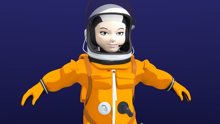
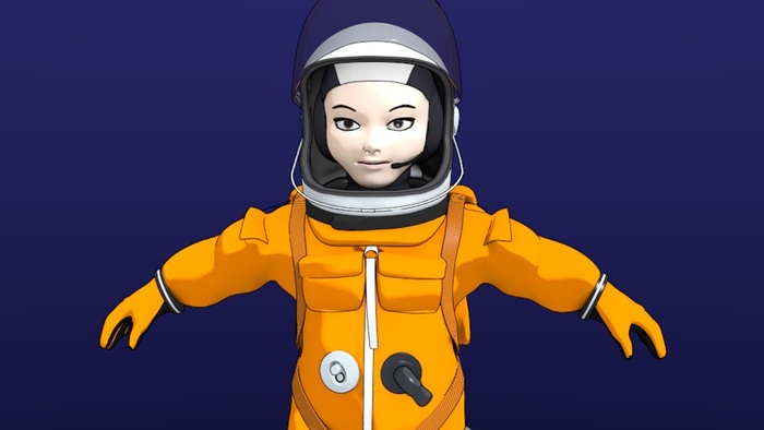
One thing we’re still considering is whether the character would look better with Freestyle line-drawing enabled. This can give a toon-shaded character a bit more definition — the result can be a bit like an anime character. Here’s a fairly subtle version of this:

There are a lot of parameters to adjust with Freestyle, though, which can alter the result dramatically. It’s also a pretty time-consuming rendering step. We can do it if we want to, but it will increase rendering times.
So far, I have preferred the unlined rendering to the lined versions I have tested, but I want to continue experimenting with this before making a final decision. It may be a matter of getting the line styles just right. Most likely, we would use this technique on characters, but not on backgrounds — somewhat mimicking the style of Japanese anime, where backgrounds are painted, while foreground characters and objects are inked and colored.
Of course, this is one of the last directing decisions I need to make — as it only affects the final rendering and compositing stages for the project.

