Hello everybody!
Today, I started work on following through with the posters (the “Concept Art” posters). I’ve queried our two logo sponsors and received a logo from one of them. I also checked the cost of the poster printing.
I’ve also had a chance to run over the final numbers and make sure that the overheads have all been accounted for. It turns out that when all the costs and overheads are calculated, we have about $1836, which is very nice: that will cover not only the $1600 for Daniel, but $100 incentive for Rosalyn on the script writing work, and still leave a bit for contingencies.
Given that we’re in the clear and it’s really not very expensive, I’m planning to send out copies of the concept art poster to all 47 backers (Most will be folded, as I described in a previous update. Naturally those who chose the poster as reward will get it rolled as planned). So, I’ll be sending out surveys which will ask for a mailing address for this. This is just from me, because I really appreciate all of the support, and because I’m happy with the way the portraits have turned out.
[EDIT: One of Kickstarter’s handy hints reminds me that some people might move between now and April. So, for anyone getting stuff in April, I’ll wait to send out surveys then (and also only send one package). Still learning this stuff!]We came with two designs: the “character guide” layout with the character portraits separated, and the “group photo” layout with the characters clustered together. I’m starting to favor the “group photo” design now, but I think the best thing would be to ask you all which you prefer:
1) “character guide”
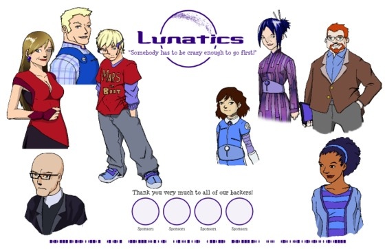
or
2) “group photo”
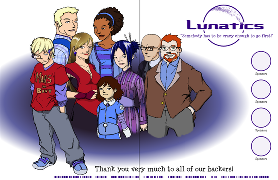
These aren’t quite finished — I need to do a little tweaking on the scales of the characters and so on. The “guide” design would probably have the character names added to label each portrait, while the “photo” poster won’t have labels. Both will have two sponsor logos (the pictures show four circles, but there will only be two logos). The crease line for the folded posters is shown on the second poster — I was trying to make sure it wouldn’t go through anyone’s face (of course it will go through the middle of the “Lunatics” logo in the “guide” design).
Leave a comment to let us know which you like better — we’ll pick which design to send to the printer based on the consensus in the comments.
Thanks again! And we’ll be in touch.
Terry Hancock