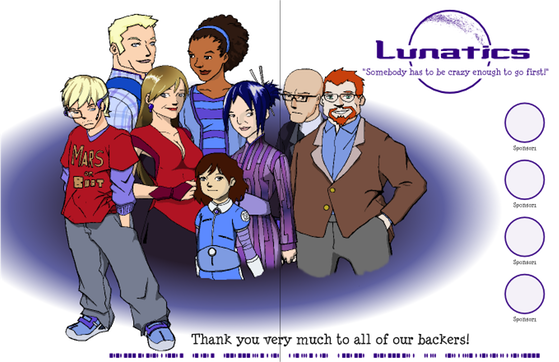
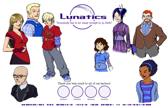
Here’s an alternate design for the Concept Art Poster, which looks more like a “group photo”. Layout by Rosalyn Hunter. Tell us which you like better.
vs
I’ve also indicated where the crease-line will fall on folded posters (although, so far we haven’t got any requests for those yet).


