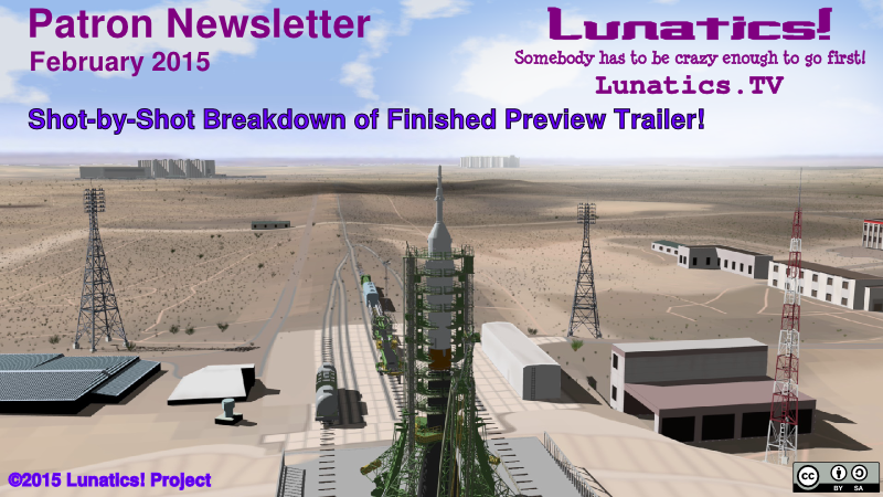
Trailer Breakdown with Commentary
The big news this month is completing the preview trailer, so instead of doing a series
of short articles, I’m just going to break down the trailer, shot-by-shot, and offer you some commentary on background, behind-the-scenes, and other info. The only other news is that we’re going to be overhauling the website between now and April, and I’ll have more specifics on that in March.
First of all, the trailer is available on Vimeo:
1
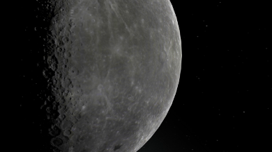
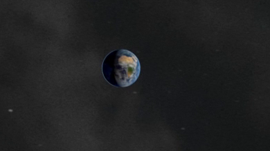
We start with a shot of the Moon, of course. This is the realistic Moon model that I created from space imagery. The color is from the Lunar Reconnaissance Orbiter, and the elevations are from the radar altimeter aboard Kaguya. It’s a pretty accurate model, although if you look closely you can see some artifacts from where I had to paint over some dropouts (holes) in the data.
The voice-over narration in this sequence is not something we’re going to do often, but this is a kind of frame-story for the whole series. The narrator is actually Georgiana, telling this story to her grandchildren many years after the fact (though it’s not critical to know this). Which establishes that this is a story of a successful colony, and not (as is more common in SF films) a failure. There will also be a closing narration for the very end of the series, which of course, is locked in our special spoilers vault, not to be brought out until much later!
The narrator, Melodee M. Spevack, is an anime and film voice-over actress with quite a reputation. I was a bit taken aback by her application to our casting call — but unfortunately, there wasn’t really a good part for her in the series, so I asked her to do this narration. I’m glad I did, because she really knocked it out of the park.
2
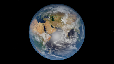
Do you see the skull? Total coincidence! It’s just the way the cloud cover and Africa look from that angle. No really! I actually spent some time trying to get rid of it by changing the angle. But then I noticed that it coincided with the “space is a scary and dangerous place” line, and realized that a subliminal skull was probably okay!
I did quite a bit of work to get the starry sky and Milky Way elements for the background in these shots. This map, based on real stars, was created by amateur astronomer Paul Bourke. The Milky Way is derived from from several sources — I went into this in our November 2014 newsletter.
3
The zoom into the “blue marble” shot of the Earth is a bit clichéd by now, but it’s part of the “hard science-fiction fairy-tale” atmosphere I wanted to create for the whole pilot episode — combining a kind of lyrical aesthetic quality with very solid science and technology.
The shot ends up right on the meridian where Western Kazakhstan is located — which is where we go next.
This shot sequence, including this zoom and the train sequence following, were part of the concept from very early on. I had a tutorial in Free Software Magazine in 2010, and a YouTube video of my early animatic. The length more than doubled from the storyboards to the present. Storyboard animatics are not nearly as effective at getting the timing right for moving shots, because static shots always feel longer than moving ones.
4
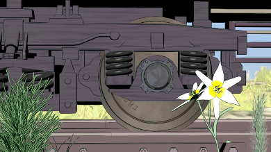
The Earth fades into the wheel of the train, establishing one of the visual themes in the pilot, which is circles and cycles of motion. This is a visual metaphor for the huge machinations that have to be put into place to take this step. You don’t just hop on a transport and take your daughter to the Moon, even in 2040. It’s a big, expensive production, which elevates the philosophical question of why you need to do it.
The flower in front is called a “Snowdrop” in Kazakhstan, although I think it is not the species we normally call “Snowdrop” elsewhere. It’s one of the earliest flowers to bloom in the Spring, and serves as a time indicator to those paying attention — this is April, 2040. Unfortunately, I really had to guess on the size of this flower, as the pictures didn’t make that really clear. The other grasses are just generically similar to the steppe grasses I found in photo references.
You’ll note that you can see the flower reflected in the hub of the train wheel. This was no mean feat, as the plants are composited in front of the train, and some of the plants are billboards, which wouldn’t reflect correctly anyway. I achieved this by creating an 2-layered orthographic projection of the reflected view, like a giant, long billboard alongside the train (well two of them — one for the close plants, and one for the embankment behind them). This is what’s actually being reflected by the ray-traced mirror material on the hubs.
Finally, there’s three art-design easter eggs on the hubs for those familiar with science-fiction. The chalked “42” of course, is a reference to Douglas Adams’ “Hitchhiker’s Guide to the Galaxy”. The other mark (also harder to see in the moving shot), says “ГНДН-69105”. What’s that about? Well, as a hint, “ГНДН” are the Cyrillic characters for “GNDN”. 69105 is a mathematically interesting number that was frequently used in Infocom text adventure games.
5
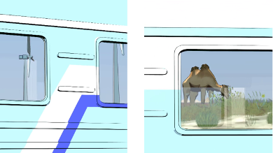
The camera tracks across the windows of the train, revealing some landscape details behind the camera. We see modern windmills, which we imagine to be more common in 2040, even in remote locations (perhaps especially in remote locations). There may actually be some of these in Western Kazakhstan today, but I didn’t research that.
And of course, there are two Bactrian Camels. This is one of the few places in the world, where you will find free-living Bactrian Camels, so this is a place clue, telling us we’re in Kazakhstan. The camels were contributed through a challenge on BlendSwap, by Mat Behr, because I couldn’t find any stock camels other than the single-hump Dromedary type. But I apparently had notices turned off or something, because it took me nearly a year to notice that my challenge had been accepted and completed. Embarrassing!
The reflected scene includes Freestyle ink lines, which cannot be reflected by mirror materials in Blender (Freestyle is a post-process added, so the lines aren’t “there” when the reflections are calculated). This is actually achieved with compositing of a “reflection camera”. I described this setup in my October 2014 newsletter.
To make matters worse, the camels’ legs are obscured by the ground cover plants, but they are a particle system of billboards, so they don’t enter into the visibility calculation for Freestyle lines! I fixed that by using a proxy “grass tops” object when doing the Freestyle calculation, which causes the lines to disappear before they get down into the grass.
6
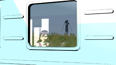
And finally, the camera reveals Georgiana herself peering out the window, transitioning our focus from the reflections to the inside of the train.
In fact, this was the first time I’ve edited using the “Action Editor” and the “NLA Editor” for combining motions — breathing, turning the head, blinking, etc. — for more complex movements. It was a little tricky, and I actually ruined a bit of the tail-end of this shot, past where we make the cut here. This will get revised when we use this shot in the first episode.
Up to this point, this is almost exactly like the first couple of minutes of the pilot episode. The only difference is that the music will be slightly different, and we’ll start into the dialog on the train at that point.
7
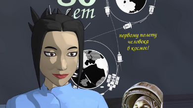
Having to cut the previous shot short, left me with a bit of a problem, since we had to fill a few seconds of screen time before the music picked up. Also, everything we’ve done up to this point makes the show seem to be entirely about Georgiana. But the episode is more balanced, with Hiromi getting quite a bit of screen time (and a lot more lines). The problem was that, up until now, we haven’t had the character model for Hiromi ready for animation. But we do now, and so I decided to get Hiromi into the picture.
Another thing we had not previously demonstrated was lip-syncing a line of dialog — clearly a necessity for our production. So I decided to find one thematically appropriate line and animate that. Of course, this line is taken from the pre-flight press conference.
Another problem, though, is that we do not have the set yet for the scene this line is supposed to take place in. But I did make some wall art for this scene, including this “80 Years of Man in Space” poster, so I just composed the shot, such that the poster fills the background. Of course, in 2040, it’ll actually only be the 79th anniversary of Yuri Gagarin’s flight — the poster is advertising the event for next year.
I wasn’t really careful with the alignment of the poster, which resulted in Yuri Gagarin “photo bombing” the bottom of the shot. That image of Gagarin, by the way, is from a public domain Soviet-era postage stamp.
8
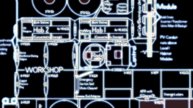
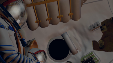
Since we were a little worried that the lip-sync wasn’t going to work well enough, we considered doing Hiromi’s line as just a voice-over. For that, we’d need some kind of abstract shot, and of course, one thing this preview doesn’t show is the ISF-1 Colony (because we have not even started on building that huge virtual set).
We do have floor plans, though. So I did a “video-terminal” style treatment to those and panned the camera across them.
I was able to get the lip-sync to work, but decided I liked the pan across the colony plan, so we just faded from one to the other.
The rest of the trailer is a brief synopsis of the trip to the Moon, showing off the mechanical models of Soyuz and the Lunar Transportation System, which we have already created.
9
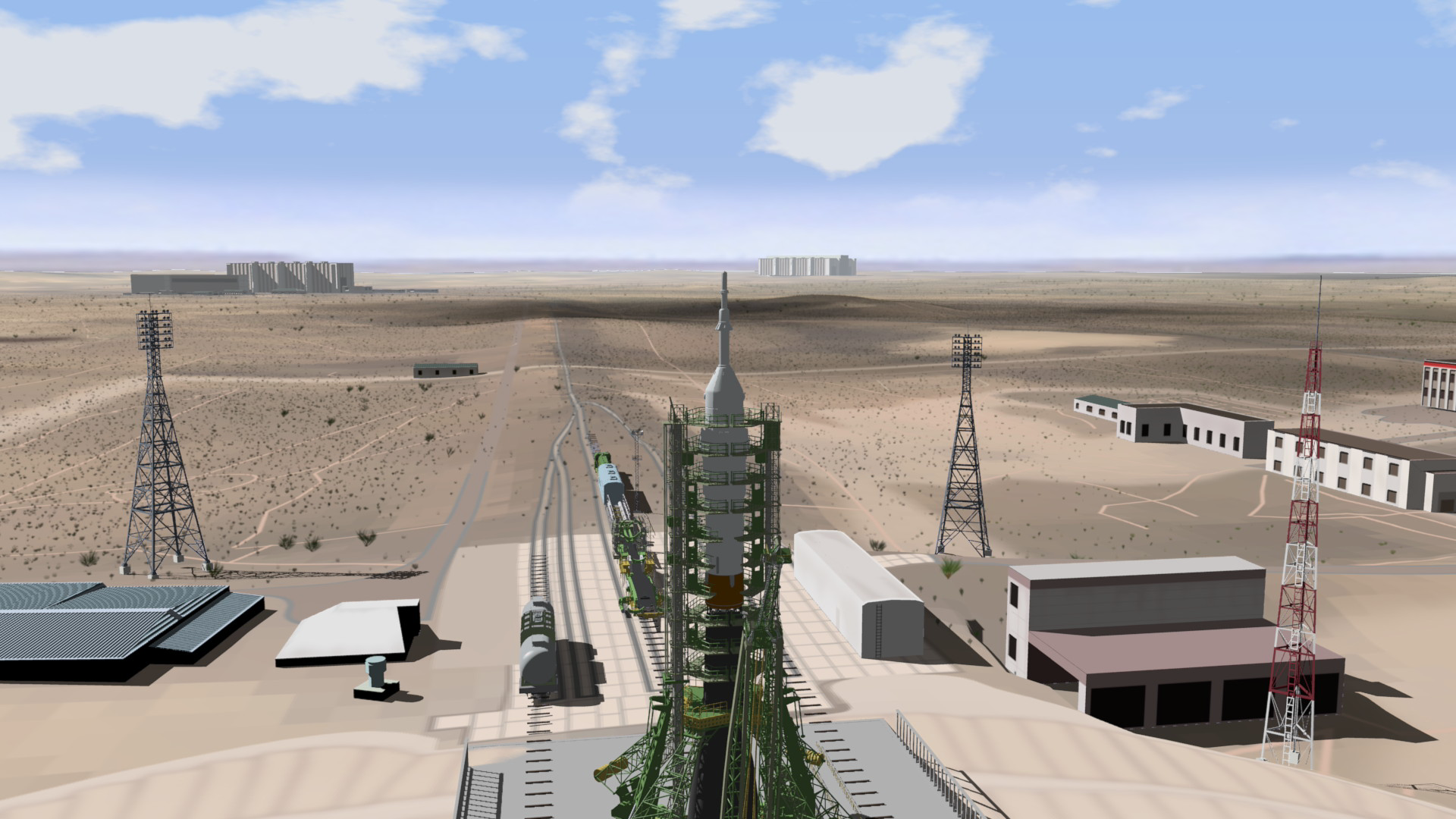
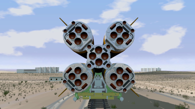
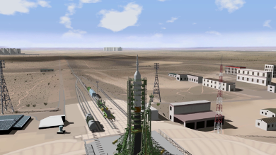
This is another shot that has been in the plan from the beginning. This shot of the rocket nozzles of the Soyuz is just so iconic, I had to include it. In the episode, there will actually be some people walking along with the rocket, which is more realistic, but we don’t have those character models finished yet.
This shot and the next one are both on the same enormous exterior set model — the distance to the “horizon” in these shots is about 6 kilometers of virtual space in the model. This required some really huge texture files, although you can actually see that the detail is not quite fine enough yet. That’s probably going to need some tweaking before the final version that goes into our episode.
10
And this shot is the reason we needed such a large virtual set. From up above the Soyuz gantry, you can see a long way — I actually calculate about 35 kilometers, in real life, which we cheat a little bit on, using a backdrop for the far background.
You might also notice the moving cloud shadows, which are generated from the cloud dome over the set, which is slowly moving through the shot.
The buildings are really simple box models, with color and normal mapped textures.
11
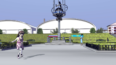
This shot establishes the location (front of the train station in the town of Baikonur).
It’s also our first body animation cycle — which is of Georgiana skipping. This animation probably still needs a lot of refinement, even though it’s a given on this project that our character animation is going to be fairly limited by time and effort constraints.
There definitely wasn’t time to re-do this shot, though, as it took about 9-minutes per frame to render (a total of over 40 hours wall clock time). This is why I originally budgeted for a dedicated rendering cluster — Freestyle really eats CPU cycles!
The train station is a little different from today. Instead of open-air terminals, we have large indoor terminals depicted in the back of our shot. The idea is that Baikonur, being a spaceport town, has come up a bit in the world, and made some civic improvements. However, most of the other stuff you see here, is just like it looks today.
The sculptural train sign here was created by Sathish Kumar, as well as the park benches and lamps. Most of the other elements were created by Terry Hancock.
12
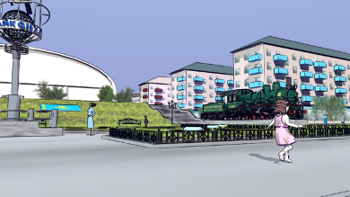
As the camera pans, we can see the “Cosmotrans” steam train on display, as well as some of the background buildings, which I was frankly surprised held up as well as they do — like the buildings at the launch pad, these are little more than boxes with textures on them to provide detail.
Unfortunately, Hiromi is not moving in the background. That’s because she’s actually part of the background set file — left over from last month’s newsletter cover. I considered taking her out and re-adding her as a character I could animated, but for time reasons, I just left it as-is.
13
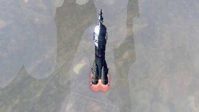
I’ve been using this “look and feel test” shot of the Soyuz pod-staging sequence for sometime now. It’s not quite complete — in the episode, the Soyuz will have decals added. We may also try to make the pod escape sequence more accurate. Although in our depiction, the pod simply comes straight down, and then peel out in a petal formation, they actually pop out from the bottom first. I didn’t really think anyone would notice the discrepancy, but somebody caught us, so I guess it’s more visible than I thought!
14
This shot is an unaltered piece of our earlier “teaser trailer” demo, which used a little bit different (more photo-real) animation style. This didn’t look as good, but in order to re-do these shots, we have to finish revising the Soyuz interior set, which has not yet been finished. The spacesuited figures don’t show any faces, partly because we haven’t updated those models yet.
15
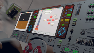
This is from the first teaser trailer, showing the “Soyuz-SF” control console, which is loosely based on the present-day “Soyuz-TMA” “Neptune” console. The main difference is that we’ve converted some of the less-critical button arrays into to touchscreen panels.
The main displays were animated in Synfig by Timothee Giet. The secondary panels were animated using Inkscape and a lot of patience, by Terry Hancock.
Again, this is still in the obsolete animation style, but this shot probably isn’t too far from what our toon-shaded version will look like.
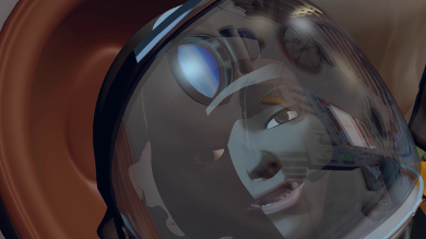
16
We had to have this reaction shot, even if the animation style isn’t correct.
We are going to revise the Soyuz set and re-render these shots, but it was clear that it was too much to do before releasing this preview.
17
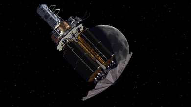
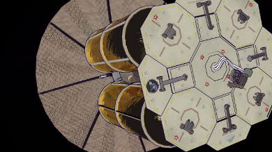
These two shots are of the Lunar Transportation System, which is our “Moon Shuttle”. This is significant for several reasons. It’s the first real science-fiction element in the show (technically, our Soyuz is an updated version, but we stuck very close to the real designs). It’s the first element of the show that we will be seeing much of in later episodes (a major recurring element). It represents a lot of creative effort from Terry Hancock as director and art-designer and Chris Kuhn as mechanical modeler.
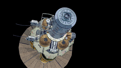
18
This is a great iconic shot, combining the Moon shuttle and the Moon. This is meant to be the first shot of the third and final part of the pilot story arc.
The last few shots are all mechanicals, and all based on the Lunar Transportation System, because that’s what we have completed. There’s a lot of models for the Moon part of the show, that we just haven’t started on. And of course, most of the models we’ll be seeing in every episode are from that set. I can’t say this was exactly a planned result, but I like the fact that we’ve had a chance to work together and get to know each other better before attempting to work on these models that are going to form the backbone of the show. It gives us a chance to work out the bugs in our workflow, and figure out what’s really important.
19
This shot is meant to be the LTS Service Module, after separation. It’s actually just a piece of the materials turn-around shot, with the updated textures. I recently added a lot of the smaller decals for this, but otherwise, it’s pretty much the same as it was.
20
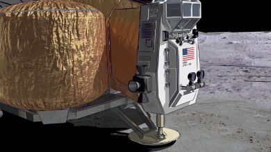
I’ve been anxious to do this shot ever since Chris gave us the constraints-based compressible footpads. Which are awesome!
You might expect to see a puff of dust come out from under the footpad just as it lands, but this is caused by the air being squeezed between the pad and the ground, and wouldn’t happen in a vacuum. We’ve also cut to after the engine is already shut down, so the lander is just freefalling to a stop here.
After thinking it over, I realized there really wouldn’t be a lot to see, which of course makes this shot simpler.
21
The dramatic structure of Lunatics is a little unconventional, since we don’t pick a single protagonist, or even a couple of them to follow, but instead have eight fairly evenly-balanced characters. The idea is that individual stories will focus on different characters as the main characters for that episode. And then every once in awhile, we’ll have a genuine “ensemble” episode. We follow this pattern within the pilot as well, by spacing out the introductions of the characters.
To visually communicate that we’re just telling Georgiana and Hiromi’s story here, but that there will be others later, I hit upon this concept of showing these main characters, and fading them into the silhouette line-up with the others in the logo.
![]()
22
And that’s it — we finish with the “medallion” logo for Lunatics!
![]()
Full Credits for the Preview
Available from our website.